Ink on Paper III: 손동현 Donghyun Son


손동현 개인전 《Ink on Paper III》는 그림의 재료를 주제로 한 3부작 중 마지막 전시다. ‘ink on paper(지본수묵)’는 작가가 작품 캡션에 사용하는 문구로 ‘종이 위에 먹’을 의미한다. 이 3부작 전시는 그가 작업의 새로운 방향을 고민하고 있을 때 작품 캡션에 항상 들어가는 재료를 하나의 주제로써 접근해보자는 생각에서 출발했다. 2015년에 열린 전시는 먹(ink)을 주제로 했고 2020년에는 먹과 다양한 잉크를 함께 사용한 작품을 선보였다. 그리고 마지막은 종이(paper)에 초점을 맞췄다.
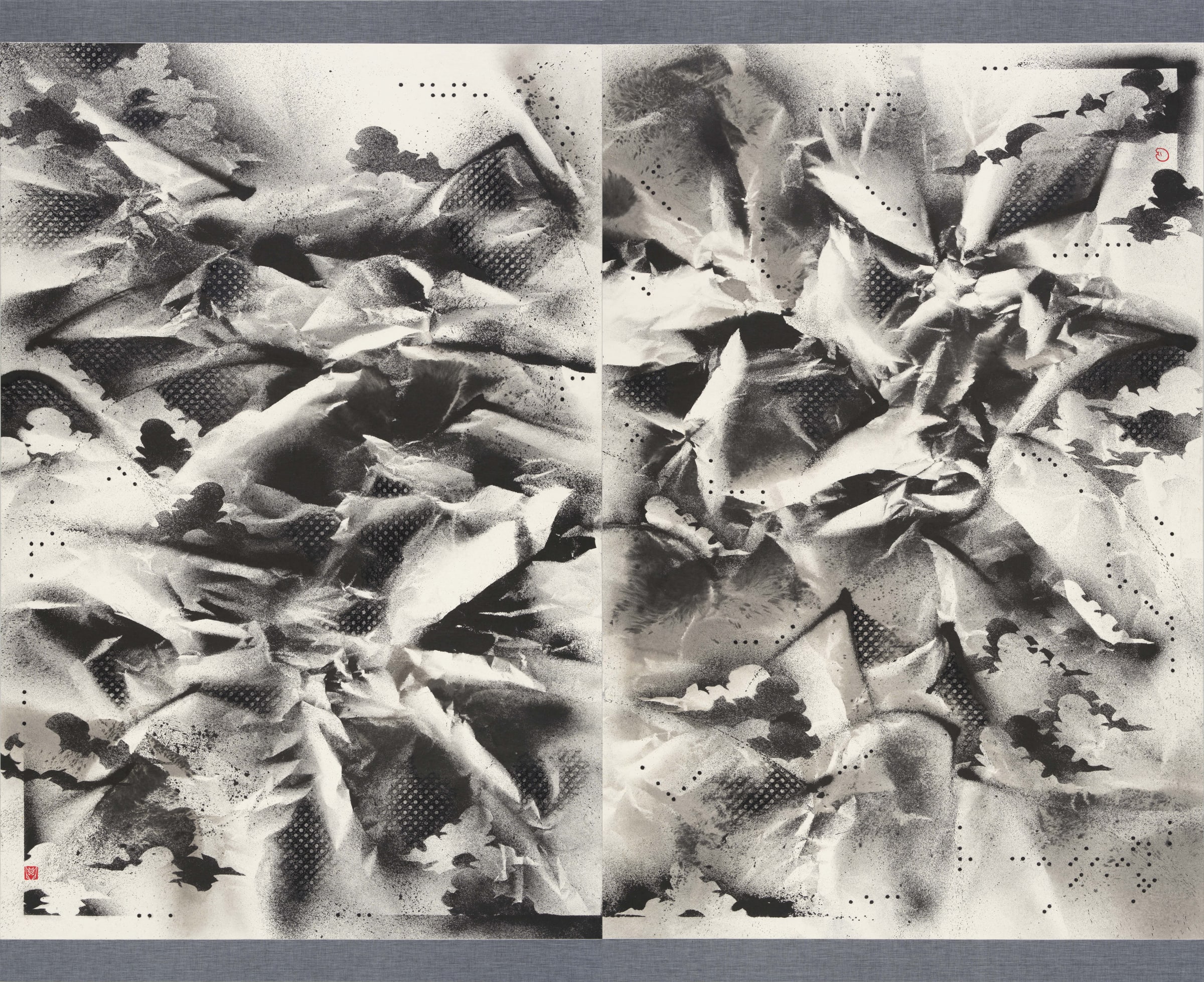
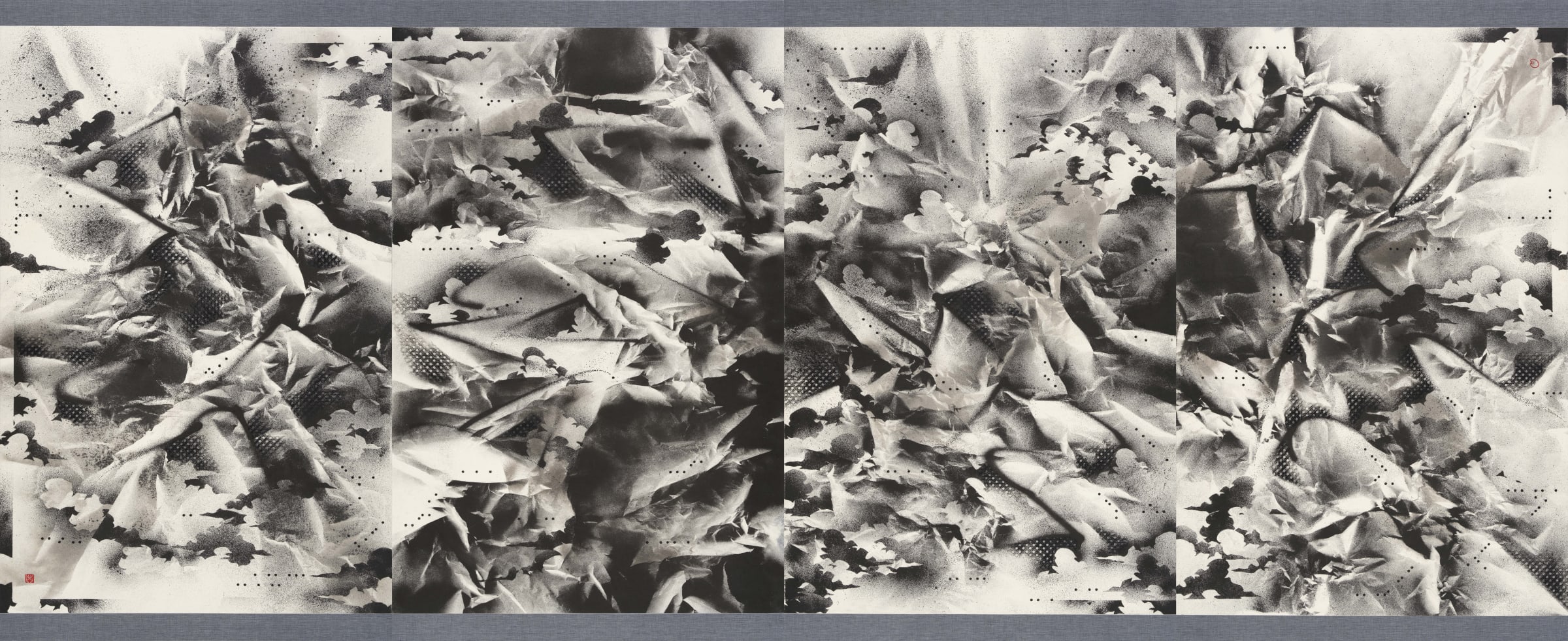
그림의 바탕이 되는 한지(韓紙)는 인쇄나 필기용으로 쓰는 양지와 성질이 다르다. 롤러로 압착시키지 않고 발로 떠서 그대로 말리기 때문에 종이를 이루고 있는 섬유질 사이의 틈이 많다. 한지는 양지와는 다르게 잉크 번짐을 막는 송진이나 활석가루를 넣지 않고 순수 섬유질만으로 만들기 때문에 물이나 염료가 잘 스며든다. 이런 원리를 효과적으로 응용한 결과가 바로 동북아시아의 전통 회화다. 종이가 캔버스 천보다 약해 보이지만 사실 성질이 오히려 더 질기다. 구겨진 종이는 물을 뿌리면 다시 펴지고 접으면 스스로 세워진다. 그래서 동양에서는 그림을 그린 종이를 이용한 화첩, 부채, 족자 등 다양한 표구 방식이 발달했다.
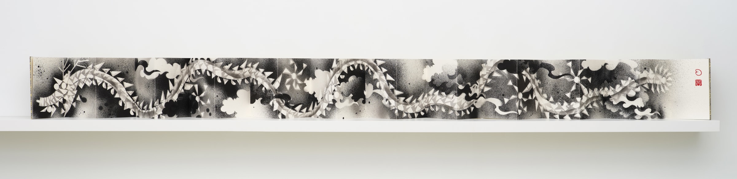
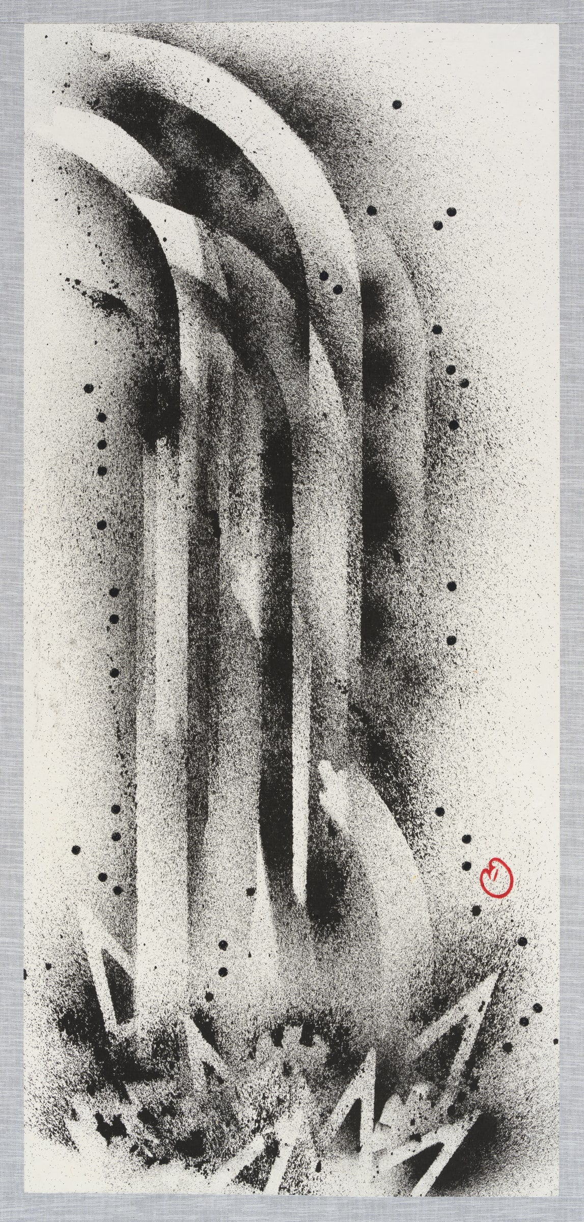
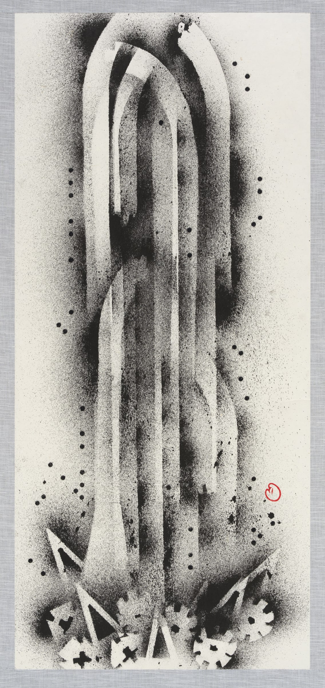
이번 전시가 종이에 집중한 반면 배제한 요소들도 있다. 첫째는 색채다. 다양한 색의 잉크를 사용했던 이전 전시와 다르게 먹만을 사용했다. 한지 위에 가장 안정적으로 안착하는 특성을 최대한 활용하기 위함이다. 두 번째는 인물이다. 손동현은 그간의 작업에서 전통적인 초상화의 개념과 작화법을 다뤄왔고 이후 준법을 응용한 작업에서도 인물의 형태를 기본 골조로 삼았지만 이번 신작에서는 인물이 등장하지 않는다. (가장 흥미롭게도) 배제된 세 번째 요소는 붓을 사용하지 않았다는 것이다. 캡션 내용에 붓(brush)가 포함되지 않는 것처럼, 모필(毛筆) 없이 다양한 도구와 기법을 활용한 수묵화가 이번 전시의 특징이다.
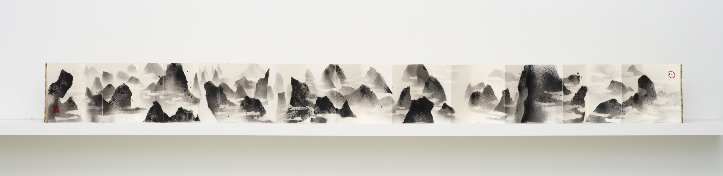
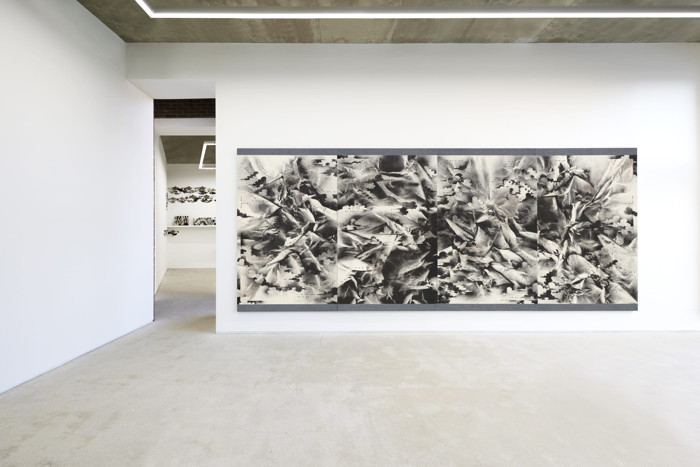
<3P06>와 같은 평면 작품은 구겨졌다 다시 펴지는 종이의 성질을 잘 보여준다. 먼저 종이를 구겨 산 모양을 만들고 여러 방향에서 분무기로 먹물을 분사한다. 형태 그대로 종이를 말린 후, 종이에 물을 뿌려 화판에 당겨 붙인다. 입체적인 상태의 종이에 분사한 먹은 평면 위의 봉우리와 골짜기가 되고, 평면 상태에서 필선(筆線)에 가까운 분무와 스텐실 기법으로 산세를 강조하고 구름을 새긴다. 마지막으로 종이를 화판에서 다시 떼어내서 듀플로(유아용 레고) 판을 탁본하여 입체감을 더한다. 그의 수묵산수화는 화면에 산과 물을 그리는 것이 아니라, 종이라는 지지체를 입체와 평면의 양 방향에서 다루며 만들어진다.
산수화는 손동현에게 화면에서 ‘놀기 위한’ 구도와 동세의 출발점을 제공해줬다고 한다. 자연을 그리되 객관적으로 재현하는 데 목적을 두지 않는 산수화는 화가의 시정(詩情) 혹은 이념을 자연에 의탁하여 그리는 사의화(寫意畵)다. 특히 수묵산수화는 사군자와 더불어 문인들이 즐겨 그렸다. 그들은 기법에 얽매이거나 사물에 세부 묘사에 치중하지 않고 그리고자 하는 사물의 진수를 표현할 수 있을 만큼의 학문, 교양, 서도(書道)로 연마한 필력을 갖춘 이들이다. 문인들이 도를 체현하기 위해 수묵산수화를 즐겨 그렸다고 하는데, 사실 그들도 화면에서 ‘놀았던’ 것은 아닐까. 그들에게 종이 위에서 퍼지는 먹의 농담과 번짐, 다채로운 먹색과 선의 표현 등 자유롭게 상상하고 표현하는 즐거움이 없었을까. 작가는 어쩌면 그들도 (자신과 같이) 이런 마음이 아니었을까 상상해봤다고 한다.
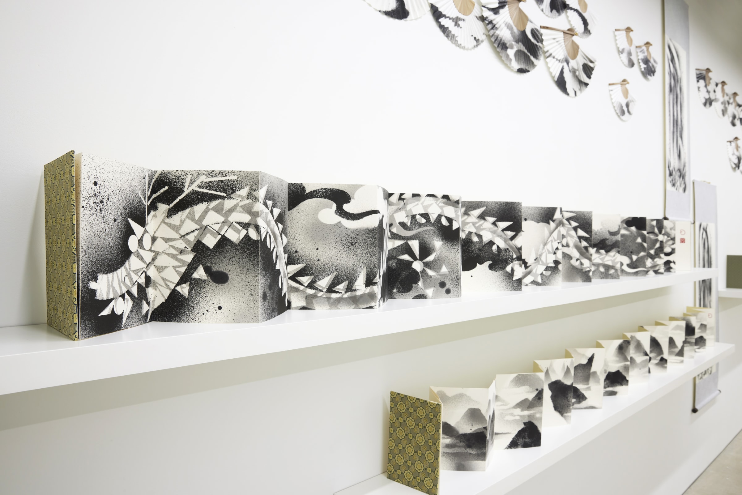
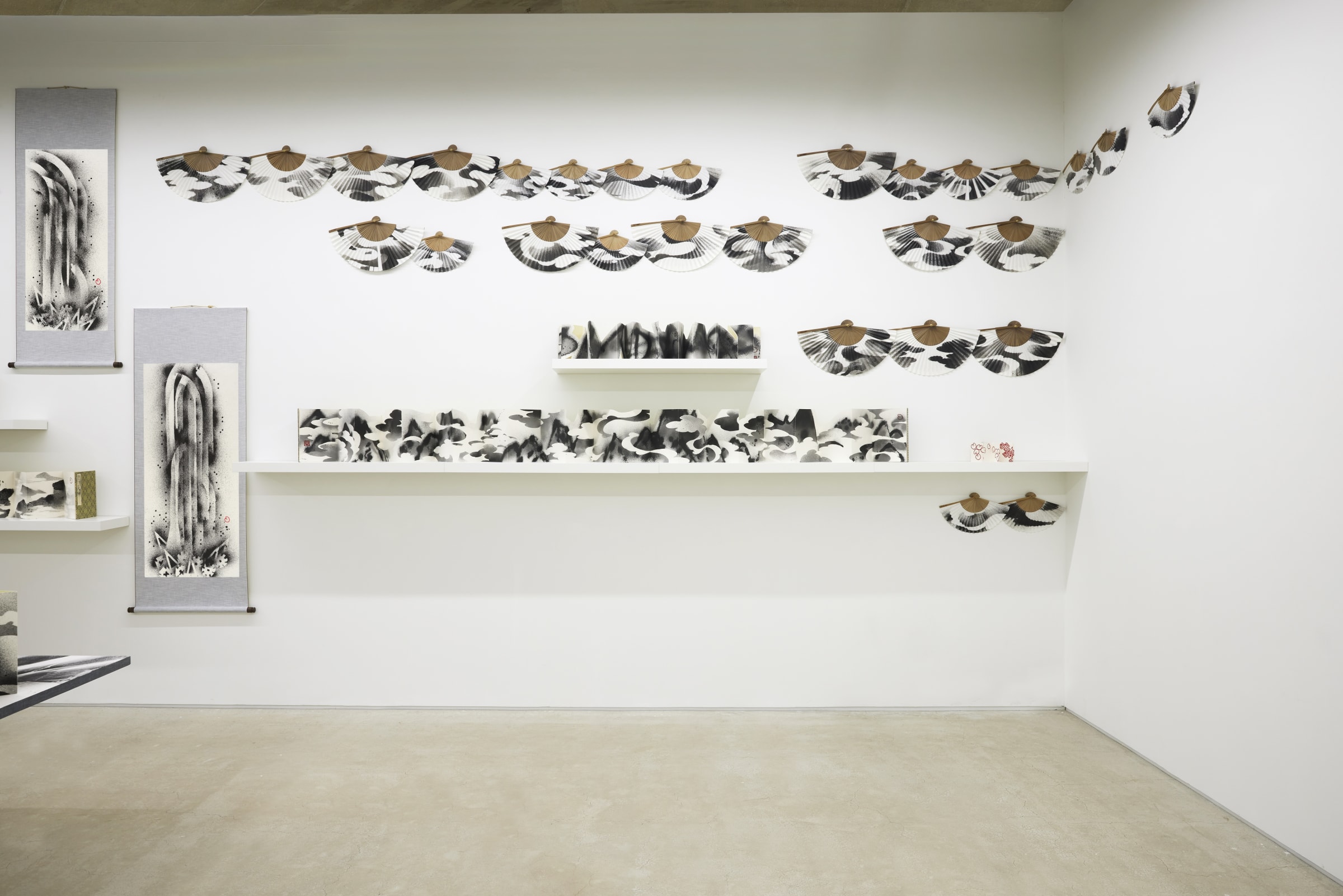
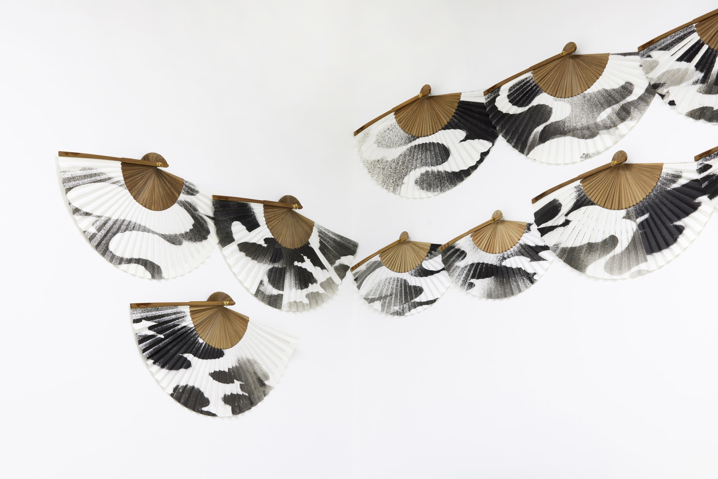
전시가 종이를 주제로 한 만큼 작품은 종이의 여러 가능성을 보여준다. 장난감 기차 레일을 종이 위에 올려놓고 먹을 분사해서 만든 폭포 족자, 다양한 방식으로 세워진 산수와 용 화첩들, 그리고 먹구름 부채는 표구 방식뿐만 아니라 스텐실 혹은 탁본과 같은 기법적인 면에서도 제한을 두지 않았다. 평면 작업들이 다양한 기법을 모두 종합해서 한 화면에 담아낸 것이라면 반대로 여러 표구 방식의 작업들은 한 화면에 들어있을 만한 요소를 여러 갈래로 쪼개어 공간에 펼쳐 놓은 작업이다.
손동현은 벽에 걸린 그림과 나머지 작업들이 하나의 짝이 되길 바랐다. 그림이 구겨진 종이에서 출발해서 평평하게 펼쳐진 것이라면 족자, 화첩, 부채는 평평하게 놓여진 채 작업했지만 다양한 설치방식으로 전시장에 제시된다. 작가는 입체에서 평면으로 그리고 평면에서 입체로 나아가는 상반된 방향성을 보여주고 싶었다고 한다. 전시는 이렇게 붓으로 그린 유려한 형상이 아닌 지지체인 종이에 대해 고민하고 유희한 결과를 보여준다. 그러니 우리도 동양화란 무엇인가, 산수화란 무엇인가를 생각하기보다 ‘ink on paper’라는 그림의 재료에 주목해야 한다. 당연히 여기서 방점은 ‘paper’에 찍혀야 한다.
Donghyun Son’s solo exhibition Ink on Paper III is the last of his three-part series on the theme of painting materials. Ink on paper is an iterative phrase on many of Son’s work descriptions. The three-part exhibition format came to the artist while he was contemplating new directions for his work, and began exploring the material descriptions in his own works, and approached the materials as a theme. Son’s 2015 exhibition theme was meok (墨 – Traditional East Asian ink), and his 2020 exhibition theme was meok and ink. This third and final exhibition in 2022 is on the theme of paper.
The material used as the foundation of the painting is hanji (韓紙 - traditional handmade paper using mulberry pulp), which has distinctly different properties to its Western counterparts. Its pulp is desiccated without the pressing and rolling to even out and remove excess moisture, resulting in noticeable gaps between the pulp fibers. Unlike its Western counterparts, hanji pulp does not contain rosin or talc powder to prevent ink from seeping and running. Made only from mulberry-derived fiber, water or dyes seep in exceptionally well. Traditional painting in the Orient are largely iterations to this material characteristic. The gaps and the translucence of hanji is misunderstood for material weakness, but the fiber gives it a significant amount of toughness. Crumpled hanji recovers its original flat form when sprayed with water, and the paper has enough substance to stand in its edge when folded. It is no surprise this resilient paper was used in the East Asia as material for drawing pads, collapsible fans, and hanging scrolls, usually with a painting on them.
While gathering focus on the material of paper, there are also some elements that are excluded. First is color. While the artist’s previous exhibition utilized colored ink extensively, this exhibition only uses meok in its own monochrome state. Son limited his use of color in order to maximize stable seeping and setting of meok on hanji. Second is character. Donghyun Son’s past works have been a display of the artist’s impressive grasp on modes/techniques in traditional character portraits. His later works also showed conjugations of those modes and techniques to focus on the character form, but this third exhibition is completely devoid of any character forms. Third and most interesting is that his latest exhibited works were created without the use of a brush. Most paintings are drawn using brushes, but hardly any of them mention it in the medium or the material portion of the painting’s caption. In solidarity to that idea, the artist decided to paint sumukhwa (水墨畫 - ink and wash painting) using diverse tools and techniques, but all without a brush.
Flat works like <3P06> are great examples of hanji returning to its original form after being crumpled. The artist crumples up hanji into the form of a mountain, and applies mists of meok using a sprayer. The crumpled hanji sprayed with meok is dried, then sprayed gently with water before straightening over a flat drawing board, where it is attached. The meok applied to the crumple takes on the form of mountain tops and valleys, and further sprays and stencil methods are employed to accentuate the dynamic lines of the mountain and to add clouds. Once the process is complete, hanji is removed from the drawing board and laid over a Duplo (children’s brick-based building sets) building plate to rub and add depth. Donghyun Son’s sumuk-sansuhwa (ink-wash painting of idealized mountains and waters) does not paint mountains and waters on screen but manifests them both in flat and three-dimension form on paper medium.
The artist describes sansuhwa as the pivot point that allowed him to be playful and explore as a means of seeking enlightenment and action. Sansuhwa presents nature, but it is hardly an objective reproduction. That is not its point. It is an abstract ink painting (寫意畵 - conceptual ink painting) that is heavily based on the artist’s poetic and literary sensibility (詩情 - poetic state of mind). For hundreds of years in Korean history, sumuk-sansuhwa was a favorite style of painting alongside sagunja (四君子 - four noble ones/blossoms), among scholars and literati. These scholars were often highly accomplished in academia, cultured, and skilled in brushwork - be it painting or calligraphy. They knew how to see through phenomena, past the details and identify underlying structures and essences. Their sumuk-sansuhwa brushworks were often described as enjoyable, a pursuit and embodiment of Tao. Perhaps it was also a form of play for them. The dynamic gradations of meok on hanji, its seeping and spreading, the colorful tones and expressive lines and compositions - what could have been more free and imaginative in those days? The artist imagined those literati as having painterly sentiments similar to himself.
As a hanji-themed solo exhibition, the artist presents several interesting possibilities for hanji. A hanging scroll painting made by laying toy train tracks over hanji and spraying meok; sansuhwa and dragon picture albums stood upright in various ways; and the black cloud folding fans were created with great freedom, not only in terms of mounting methods but techniques such as stenciling and rubbing. While the artist’s past flat works sought the employment of combined techniques on a single work, his most recent exhibition presents works featuring varying mounting methods split across different spaces what would have otherwise been a singular element.
Donghyun Son wanted the paintings on the wall and all other pieces in the space to match as a singular set. While the paintings started as a crumpled hanji and unraveled itself into something more. The hanging scrolls, albums, and folding fans started flat on the drawing table and took on different forms for exhibition display. Son explains that he wanted to show opposite directions between three-dimensional to flat and flat to three-dimensional. The exhibition is the outcome of deep ponderance on something other than the painting drawn by a brush, and a playful exploration of the supporting material that is hanji. Taking his cue, the spectator must also be mindful of the ‘ink on paper’ materials, rather than ruminating on what East Asian paintings are, and what sansuhwa are. And if it came down to ink or paper, this exhibition places greater emphasis on paper.